Which Is Best for Eyes While Reading: Black on White, White on Black, or Sepia?
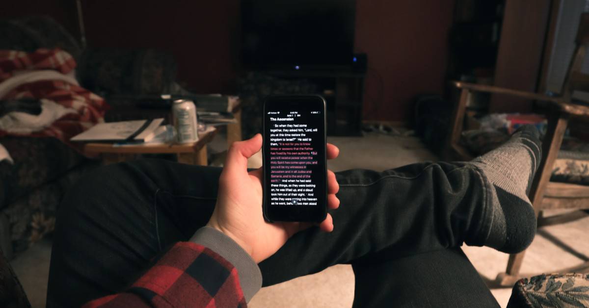
We’ve all read an e-book at night or something on our mobile phones. As it’s normal with technology, our eyes are strained and possibly damaged when exposed to such activities for a long time. Modern smartphone and kindle screens have relied on classic lighting and imitating a piece of paper when presenting written text, meaning that the default setting was – black text on a white background. But, as science developed and moved forward, the developers decided to take the readers’ health into consideration and has devised several models for reading on the screen, each of them having a specific effect on our eyes. In today’s article, we are going to present you with the main possibilities and explain which is better and why.
Sepia is the best choice for eyes while reading. Eyes react best to the mild and warm colors of sepia. When it comes to choosing between black on white and white on black, then black on white is the better option.
Be sure to stick to the end of the article, because we will explain in detail why exactly is sepia the best option and why is the “normal” mode better than the “dark” one. Let us present to you the detailed physical and technical aspects of the given recommendations.
The Modes of Reading
Although more and more devices offer a variety of customising options, the three main modes of reading a screen on a text are:
- Black text on a white background – this is the classical model that tries to imitate a piece of paper, which is white, on which there is a black text. This the general concept used in most books and is something device users are used to.
- White text on a black background – this is the so-called “dark mode”, where the colours are inverted to allow for easier reading in an environment with less light or at night; it was intended to not strain your eyes like the regular method.
- Sepia – this is actually a very specific model where the regular colouring is treated with warmer tones that give it a little more “substance”, so to say. This is a well-known technique in photography, while sepia itself is actually a reddish-brown colour, a shade of the colour brown.
Now we shall see which one is best for you, i.e., which one will do the least harm to your eyes.
Which Mode Is Best for Your Eyes While Reading?
If we’re only considering the two basic modes – ‘normal’ and ‘dark’ – the first one is better for your eyes than the second one. We shall explain the physics and the reasons why in the following paragraphs, but we have to stress out that if you consider the third choice – sepia – it is actually that choice that is the best for your eyes, as the eyes react best to the mild and warm colors of sepia. But first, let us see why black-on-white is better than white-on-black.
Note: For a better and more detailed expertise on this topic, check out Richard H. Hall’s paper titled “The Effect Of Web Page Text-background Color Combinations On Retention And Perceived Readability, Aesthetics And Behavioral Intention“, which contains more information on this exact topic.
The physics (and the reasons) behind black-on-white being the better choice for your eyes are as follows:
- When the background of your screen is white, the display is bright and the iris closes a bit more than usual, which actually decreases the effect of the “deformed” lens, which actually constituted regular ocular behaviour. With a black background, the actual iris opens a bit more to receive more light and the deformation of the lens creates a much fuzzier focus at the eye. This is known as “fuzzing effect” or “Halation” and is not recommended long-term.
- While reading an e-book or a browser on your mobile phone screen, the white colour stimulates, in nearly equal amount, the three main colour receptors in our eyes; all them. This makes reading white text on a dark background stressful on the eyes.
- It is easy to read an e-book or a browser page written in black text on a white background because the light that makes us read each word and letter is not reflected but absorbed. This causes much less strain on our eyes and is, therefore, a lot better for our health. In the case of a black background with white text, the effect is opposite because the reflected light from text scatters into each other. Addition of grey tint to the background improves the situation because it means less light reflects behind the words, making it easier for the eyes to read, thus lessening the stress on the eye.
- Black text works better because black is a colour that does not reflect light in any part of the visible spectrum, while white reflects all the colours (see below).
- White reflects all wavelengths of light. The characters in the book or the browser page being compact and close, when white reading material reflects light, the reflected light scatters and runs into neighbouring words and letters. This makes the shape of the text material harder to perceive and this strains the eyes. In comparison, when the text is black, the black colour absorbs the light around each word and letter making them easy to distinguish from one another. This causes fewer strains on the eyes.
- With just a tint of grey in the background, less light reflects behind the words, making it easier on the eyes and your sight. Since black colour does not reflect light in any part of the visible spectrum, the black text works better than white text. Therefore, fixating on the black text while reading will not put as much stress on the readers’ eyes because it absorbs the light that strikes each word.
- If you have to use a dark background, though, the text should be displayed in grey tint and not total white. This will not put as much stress on our eyes because the grey text is not as bright as white text, although this is just an alternative and not something you should pick for the long term. Grey reflects less light making it easier to read. In a dark room, white text on a black ground is not much stressful on the eyes. This is because no light is reflecting off it in a dark room.
- Likewise, black text on a light-grey background is easier to read than on a pure white background, because – again – less light is reflected behind the text. Grey text on a dark background is easier to read than white text on dark background because less light is reflected on words.
- While scanning text, white text on a dark background is fine. White reflects all the colours of the visible light spectrum into the eyes. This makes the text look bright and distinct. Since scanning of a heading, a title or a label takes a quick sweep of the eyes, there is no worry as far as putting stress on the readers’ eyes is concerned.
- Black letters on a white background can be bad for people with dyslexia and similar reading disorders.
- The most readable colour combination is black text on a white background.
- With a computer and mobile phone screens being projections, the black-white contrast is more pronounced than it is on a printed book. This increased contrast causes eye-strain quickly.
- How the text material is placed on the page of a book is also important. If the reading material is embedded and/or part of the graphic, size of pixel matters.
- Nearly 50% of the population have astigmatism and these people find it harder to read white alpha-numeric characters on black than black on white.
This does not say that white-on-black will destroy your eyesight, on the contrary – it is even better when browsing websites and reading e-books at night, but it has no long term benefits and if you’re constantly exposing your eyes to such a color palette, it might have some negative side effects.
As far as sepia is concerned, it is – if your device allows it – the best thing you could choose. Namely, research shows that switching from white to the sepia background, the strain on the eye reduces since the sepia spectrum is softer than the white spectrum. The effective radiance in the sepia background is nearly 25% lower than in the white background. This means lower screen luminescence and hence lesser visual fatigue, the lesser strain on the eyes. Visual eye fatigue is lesser while reading in the sepia background as compared to the white background. There is more eye strain, blurry vision, and tiredness in the white background in comparison with the sepia background.
This covers our analysis of the topic for today. For more information, keep following us and stay tuned for more of the same.


