
Google Messages’ Read Receipts Receive Visual Overhaul in New Update
Google may have been late adding read receipts to its Messages app in 2020, but it has been working to improve the feature ever since. These updates, now optional for users, make it easy to know when your message has been read. Over time, Google has polished the look of this feature, with noticeable tweaks showing up along the way.
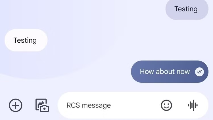
Back in August, Google started testing a new design that placed the checkmarks inside the message bubble. The updated design was subtle, with the marks right-aligned and circled to blend in smoothly. However, a recent tweak makes these read receipts stand out more with a bold white background, as reported by 9to5Google.
This change boosts visibility, making it easier to spot the status of your messages. But it’s not without its critics. Shorter messages now feel slightly crowded, according to the report.
Despite that, the overall move makes these icons pop compared to the earlier design, where they matched the bubble’s color and blended with the text in dark mode.
The redesigned read receipts first rolled out in late 2024 to a small group of beta users as part of a server-side update. Slowly, it’s being introduced to more users who already have the updated read receipt layout.
These icons, which show whether a message is sent, delivered, or read, are a big part of the RCS (Rich Communication Services) protocol that Google Messages relies on.
For anyone interested in using the feature, it’s worth noting that both your phone and carrier must support RCS. As this update reaches more people, the bold changes in design might stir mixed opinions, but they clearly aim to keep things modern and easy to read.
Have something to add? Let us know in the comments below!